Who Uses WordPress? 20 Examples of Awesome Websites
Top Brands and Celebrities That Use WordPress
It’s safe to say that WordPress is the most well-known blogging software. It powers multiple websites, with a total market share of 25%.
Stats are impressive, but they don’t guarantee that using WordPress themes will be the best choice for your website.
Check out the examples of WordPress used by the world’s largest brands and top celebrities. All of them differ in purpose and functionality, so I hope that you will come across something similar to the website you have in mind.
Contents
- Media
- Business
- Technology
- Fashion
- Celebrities
- Entertainment
- Lifestyle and design
- Photography
- Food
- Travel
Media
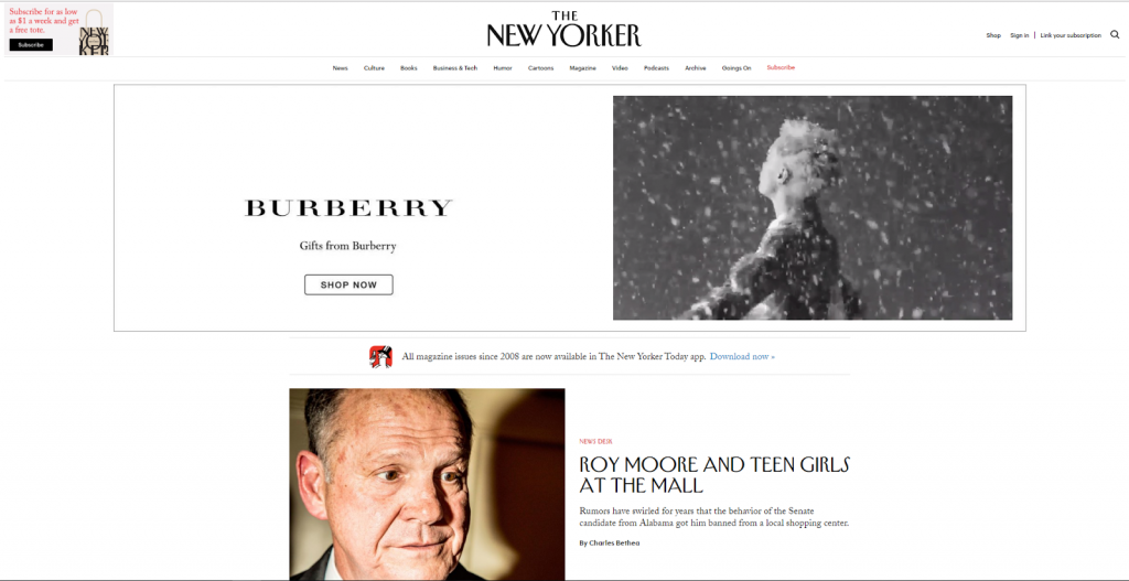
The New Yorker is an American periodical published since 1925 and famous all over the world. It had its site redesigned in 2014 and has been using WordPress ever since.
The page is not overloaded with visuals, so browsing and scanning remain easy. The sticky menu bar features 11 categories and a Subscribe button. Scrolling reveals structured grid-based layouts displaying different types of content.
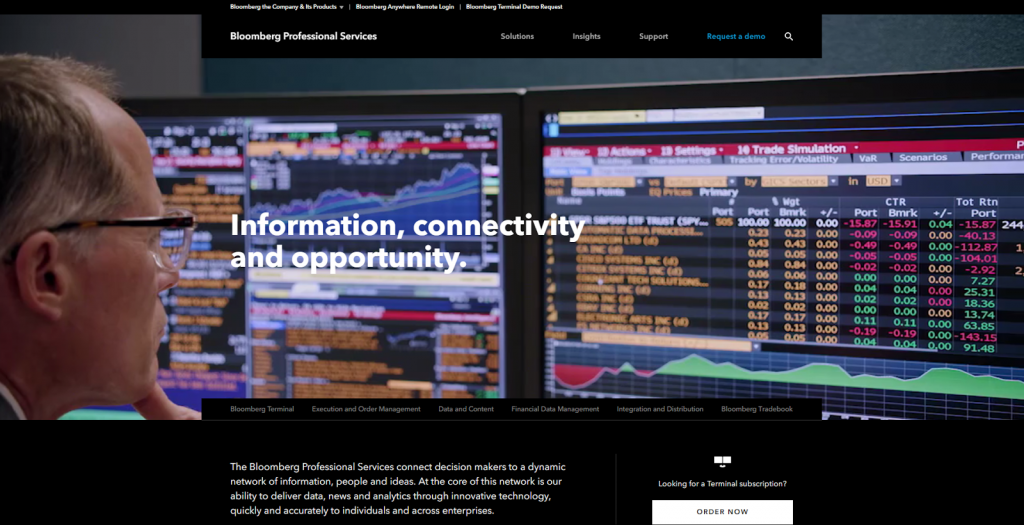
Bloomberg Professional blog is integrated into the Bloomberg main and product pages. Its layout gives you the opportunity to experience the famous Bloomberg Terminal right before your eyes.
Business
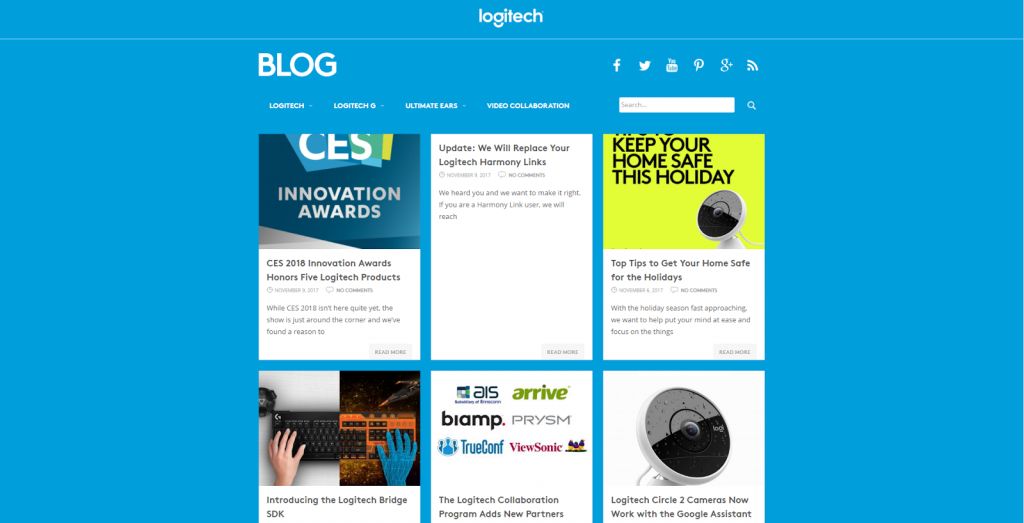
This WordPress site serves as a blog for Logitech, a company that ranks among the most popular brands in the world.
It is an excellent example of a plain design that speaks reliability, consistency, and does not distract users from the central message. The central space is made best of by a clean grid layout. The menu bar is uncluttered and highly responsive.
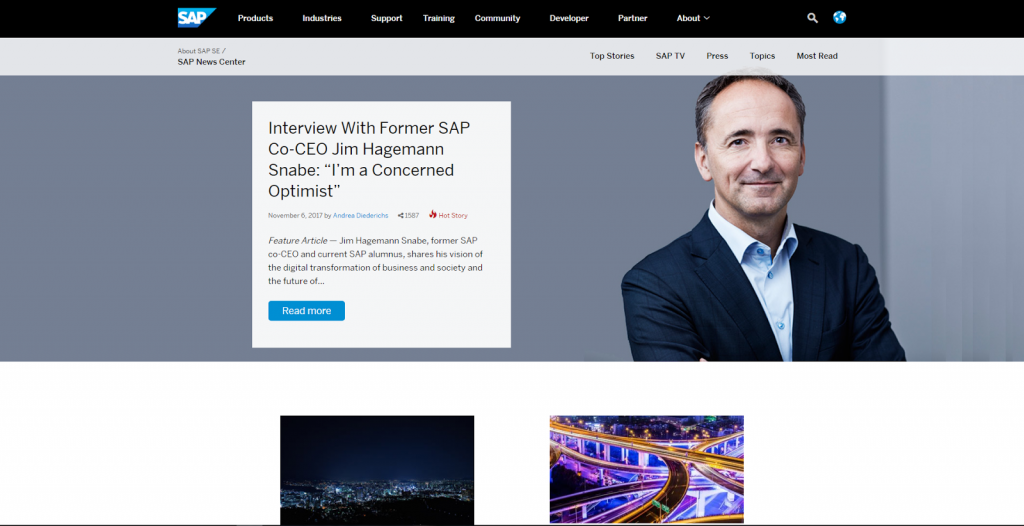
Among other major businesses that own a company blog, SAP seems to be most dedicated to using it as a platform for bringing its international community together.
Note that you can switch a separate subpage from English to any of the eight other languages available. The middle section features sliders displaying “SAP TV” video clips. At the bottom, you can see the links to the most read and most shared articles arranged in two columns.
Technology
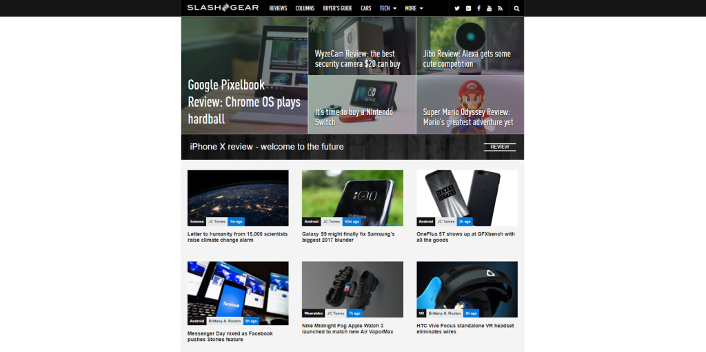
Slashgear is a WordPress-powered website with an enormous readership. It also has integrated forums and video sites that also use WordPress.
Note that there are advanced options like user tables and session sharing. The entire experience of their WordPress web page is built around reading technology news. Tiled media layout makes you want to keep scrolling, and live search ensures you can find what you came for.
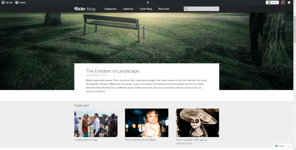
Check out the site of the online photo management and sharing app Flickr. This excellent WordPress page invites its users to savor screen-wide imagery and highly visual content organized on a rigid grid.
There are countless photo galleries structured around tags or topics and an integrated coding blog that also uses WordPress.
Fashion
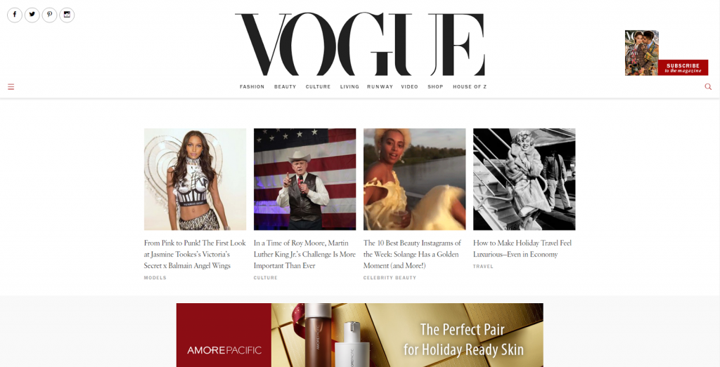
This website you would recognize without any introduction. It belongs to one of the world’s largest fashion magazines published by Condé Nast holding - Vogue.
The WordPress theme they are using is minimalistic and well-polished. A lot of white space combined with refined typography enhances readability and presents articles elegantly. Scroll down, and you will see stunning full-screen images that invite you to click on one of the posts.
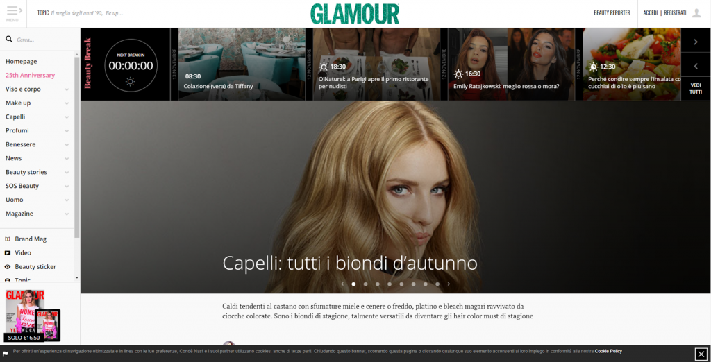
Glamour Italy is a local edition of another fashion media giant published by Condé Nast.
Note that the site has a responsive sidebar on the left of the page. One bigger media slideshow occupies the central part. The smaller slider at the top of the page features content visuals and headlines, as well as a witty widget.
Celebrities
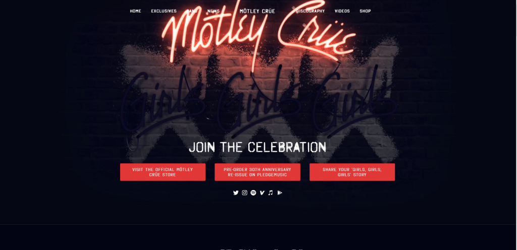
Motley Crue surely knows how to make a website design speak louder than even their music!
Right from the start, visitors are encouraged to visit the official store, pre-order an anniversary album, or share their story. The call to action buttons, though massive and contrasting, are visually balanced by a white caption. Scrolling down, you will see the band members, latest news, and discography sections.
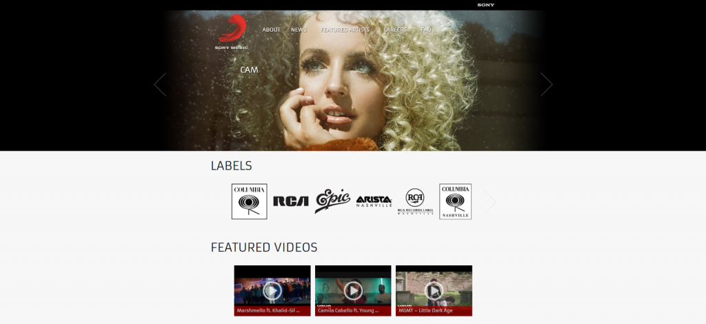
SONY Music Entertainment also has a website that runs on WordPress software.
A big slider carries screen-wide photos featuring some of the best music celebrities. The simple menu is almost invisible against such a background. The logos of music labels, featured videos, and news are placed at the center of the page.
Entertainment
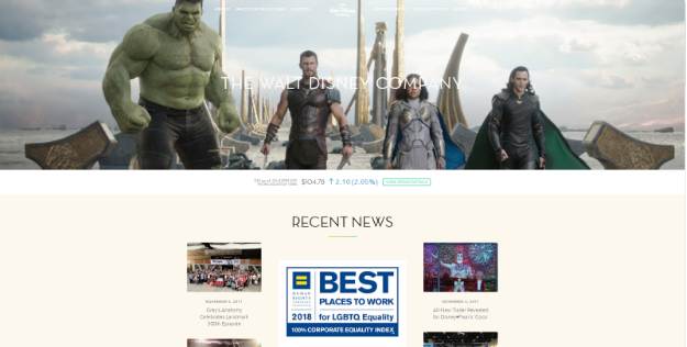
The Walt Disney company page stands out among all the other websites powered by WordPress.
It has a beautiful wide image in the header which serves as a background for a white responsive menu. The Recent News section has an attractive masonry layout. All the subcategories are displayed under it with an image, each with a small readable caption. The overall impression from this page is of ease and good taste.
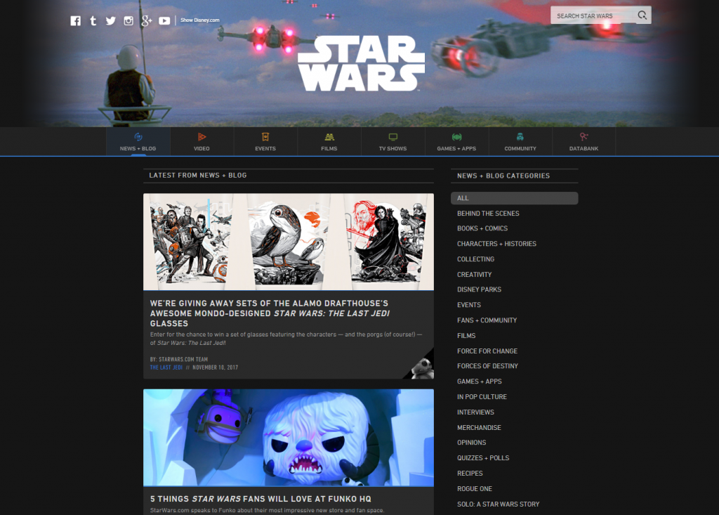
Star Wars is a legendary saga, and it has a WordPress site that is stunning.
The primary sidebar is large enough and features cute infographics. There’s one more sidebar to the right, dividing all the posts by a category. The page is content-heavy but easy to navigate. Bright visuals look even more impressive against a black background.

Lifestyle and design
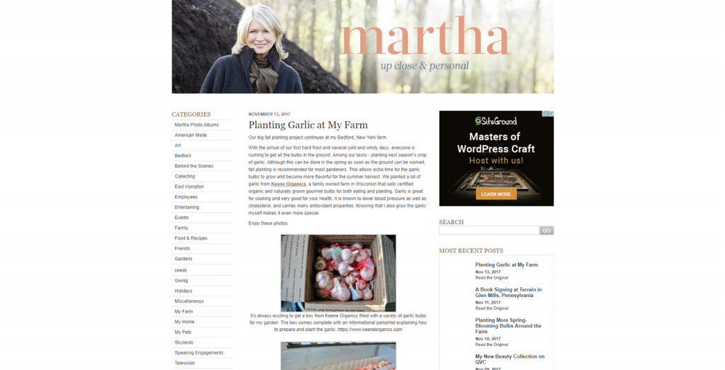
Celebrities like Martha Stewart use WordPress to keep their fans updated on the latest news and build a community.
The main page is filled with text, but it does not look cluttered due to the smart usage of paragraphs. The captions have been adjusted in size to enhance readability. All the images and headings are in pastel hues, the overall style is consistent. Here we also see a left sidebar allowing visitors to navigate through the posts.
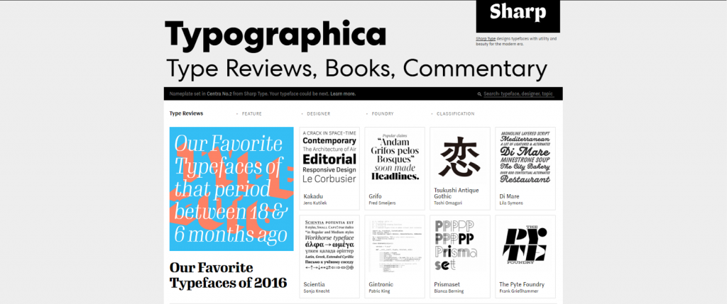
As one would expect, Typographica has one of the most typography-conscious websites out there. The large subheading actually works as a menu bar, and you can click on it to switch to one of the categorized subpages. Posts, which largely include images of beautiful fonts and a commentary, are displayed on a grid in the central part of the page. Commentaries by site contributors are arranged as a list.
Photography
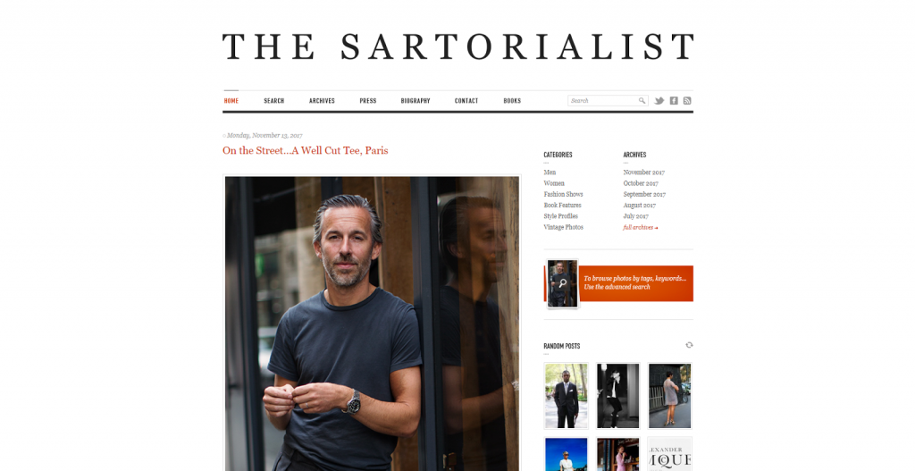
Scott Schuman is a street fashion photographer and one of many famous WordPress users.
Both the blog and its owner in the central photo look stylish. The site serves as a portfolio and, therefore, contains tons of images divided into archives and galleries. It has an additional sidebar on the right and features random photos under it. The fabulous typography and minimalistic design do not distract the user’s attention from the content but leave the best impressions.
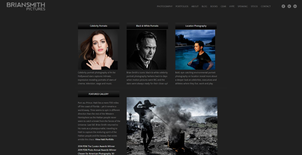
Even among beautiful WordPress sites, this one by Brian Smith stands out as a fabulous and functional portfolio.
The black theme is a nice setting for the photos. The menu bar is very simple but carefully crafted: it features categories like Gear, Speaking, and Hype. There’s one more sidebar at the page bottom, which helps to navigate the photos. The call to action button below invites you to browse through the galleries.
Food
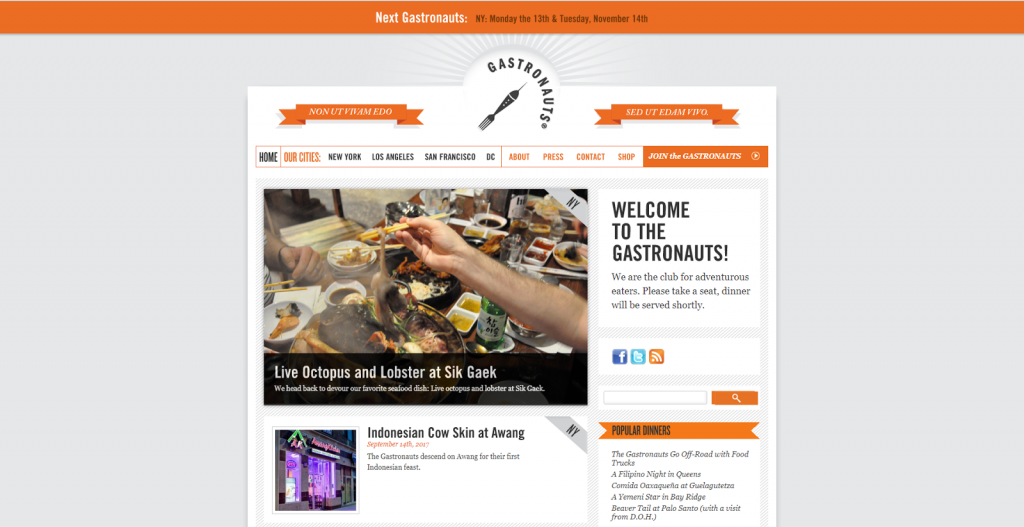
The fact that Gastronauts are a food-loving community is communicated through the abundant imagery, page logo, and even a Latin motto.
The site is based on a side menu that aids navigation, while the center of the page is occupied by a content stream. Plain design and a light palette nuanced by deep orange elements make the site capture the user’s curiosity while retaining readability and functionality.
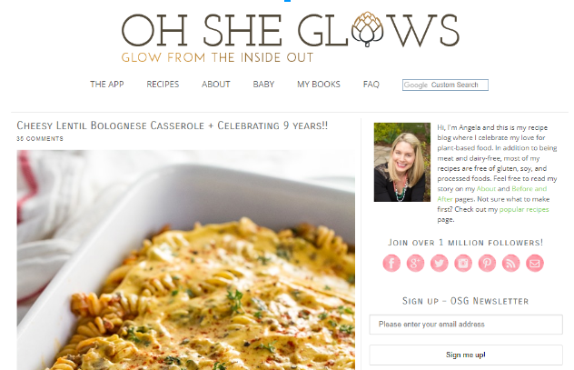
OhSheGlows invites you into the world of healthy vegan eating.
This simple theme features a lot of whitespaces and does not distract you from your main goal - to choose and try out the best vegan recipes. Massive chunks of text are balanced with big and beautiful photos. I would say that the font, color, and graphic elements in the heading section are the only, and sufficient, decoration of the site.

Travel
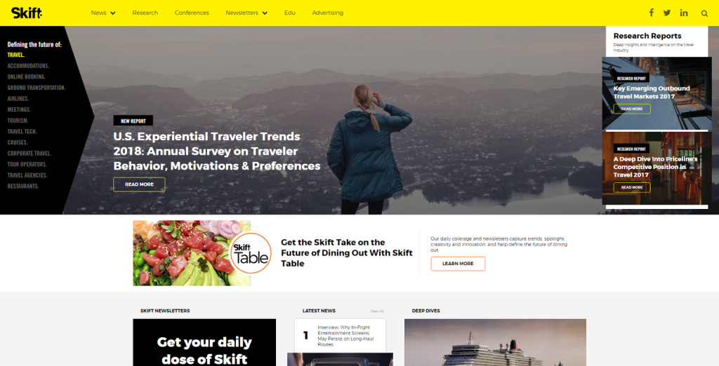
At his WordPress site Skift, Rafat Ali claims to be defining the future of travel.
The cutting-edge, customized theme does not contradict such declaration in the least. Mosaic grid, multiple bright sidebars, contrasting calls to action, wide photos, and a smart combination of light and dark backgrounds are the elements one would expect to find in a modern media property.
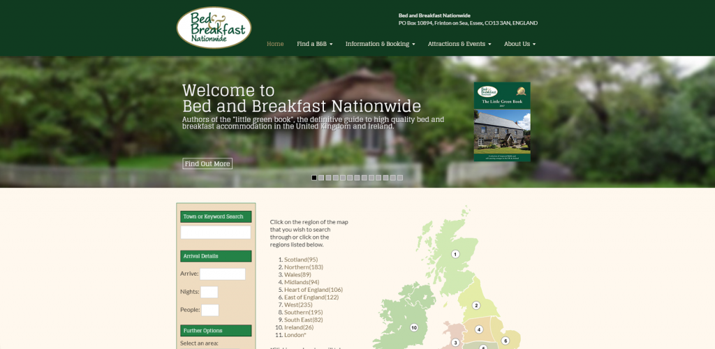
Bed and Breakfast Nationwide’s web page is highly functional and interactive.
It displays the details of each offer (address, price.etc.) on custom fields. The information itself was taken from the original site using an import function and then integrated. Users can also post their own news through a special form.
I hope that you enjoyed the selection!
If you like some other WordPress-powered websites, please share them with us in the comments!
Read Also
Cut Work Time in Half: Get These Tools for WordPress
Ways to Make Sure Your WordPress Website Is Secure
Start a Private WordPress Blog for Personal and Business Use
How To Easily Translate WordPress Theme For Your Site
10 Effective Methods to Lock down Your WordPress Website Against Hack Attacks
Get more to your email
Subscribe to our newsletter and access exclusive content and offers available only to og体育首页Post subscribers.

